LG saw rising size-related returns on its laundry appliances. I led a team of eight writers, designers, 3D artists and videographers to create a direct mail piece with a measuring tool on one side and an origami surprise on the other.
The program launched across LG’s laundry line, supported by an animated video showing what to check before purchase.
Objective:
Reduce size-related returns by helping shoppers measure their space and the path the product would travel before ordering LG laundry appliances.
Role:
Creative Direction
Product Design
Status:
Launched in 2023. Results available on request.
Awards:
2024 Golden Hermes Award
2024 Summit Creative Award
I led a team of six designers and developers in creating a 3D web-based experience that let users learn about the products, interact with them, and save and share them. This experience was an extension of the physical booth at the event. Play the video to view the experience.
Objective:
Extend Signature Kitchen Suite’s KBIS booth into an interactive experience that let attendees explore, save and share products during and after the show.
Role:
Creative Direction
UX / UI Design
Status:
Launched at KBIS 2024.
For the inaugural Las Vegas Grand Prix, I led a team of five to create out-of-home (OOH) creative that paired Formula 1, the top racing series, with the LG OLED, the top television on the market. We delivered in two weeks, and the creative ran inside and outside the Bellagio Fountain Club.
Objective:
Create an OOH campaign that connected the LG OLED with the Las Vegas Grand Prix.
Role:
Creative Direction
Status:
Launched in 2023.
To support the CROWN Act, which Dove co-founded to end race-based hair discrimination, I created a pack of five bespoke CROWN Day stickers for social platforms and the GIPHY library, which together have more than 59 million views. I combined Dove’s brand fonts with handcrafted typography and custom illustrations.
Objective:
Create bespoke illustrations in support of Dove and the CROWN Act.
Role:
Brand Design
Status:
Launched in 2021. View on GIPHY.
I led a team of four in creating an exploratory product page for the LG WashCombo All-In-One, part of a larger 360 campaign. The page introduced the product to shoppers looking for efficiency with a small footprint in the laundry category. In the process of creating this experience, we developed the key visual and animation that were adopted across all strategic consumer touchpoints.
Objective:
Introduce the LG WashCombo All-In-One with a landing page that helps shoppers understand its functions and benefits.
Role:
Creative Direction
UX / UI Design
Status:
Launched in 2024.
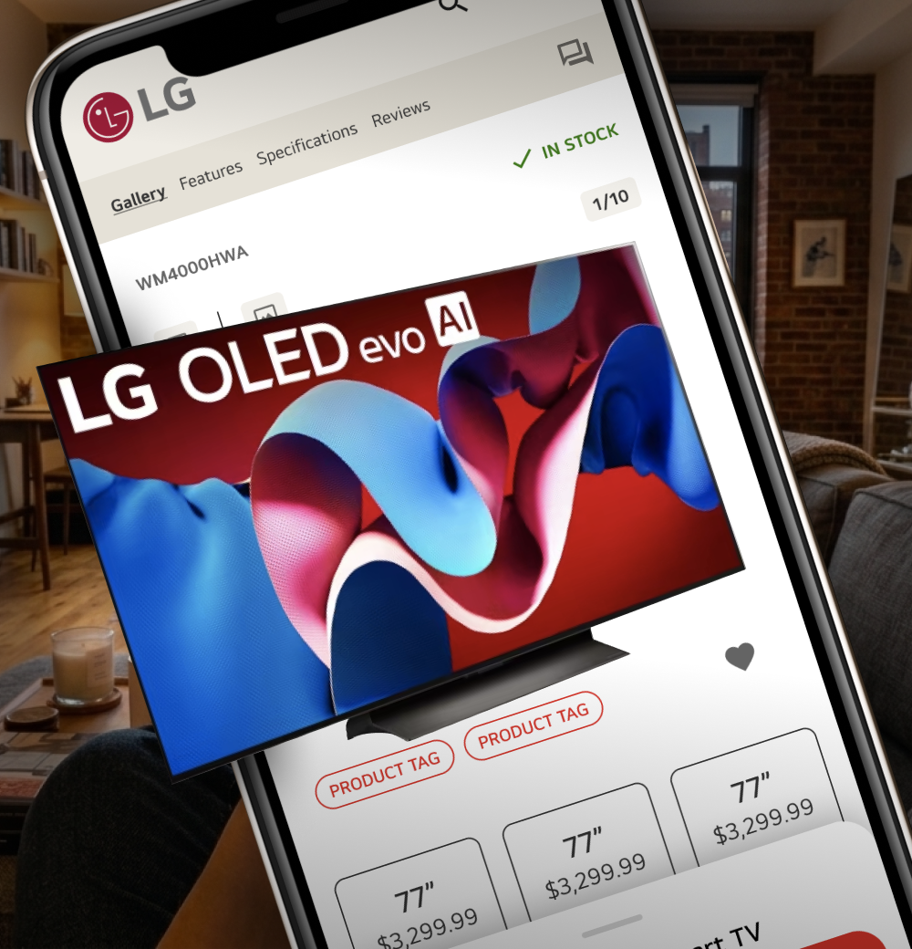
LG’s mobile product pages combined imagery, feature lists and purchase details in one long scroll, which led to user fatigue and abandonment. I independently explored restructuring the page into two streamlined scrolls, one for product information and one for the buying journey, connected by persistent anchor navigation.
Objective:
Optimize the PDP mobile experience to reduce bounce rate and improve conversion.
Role:
Product Design
UX Design
Status:
Concept presented to leadership.
I refined Dove’s initial logo concept by defining constraints and exploring color palettes to extend across product variants.
Then, I worked with a team of creatives to define the tone of voice and photography that would fit within the larger Dove brand catalogue.
Objective:
Refine and expand on the branding and identity for a new product line for Dove.
Role:
Art Direction
Design
Status:
Brand toolkit delivered to Dove.
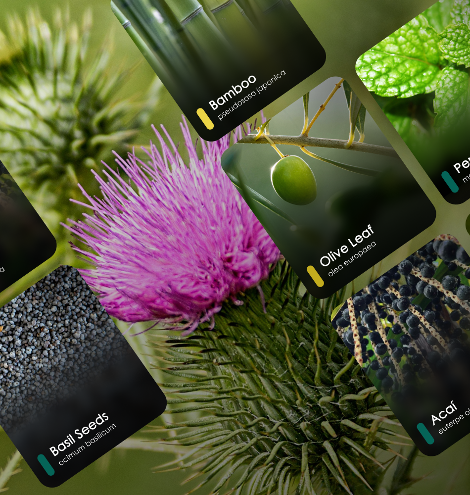
I worked with a developer to build the database, designing an interface that was both easy to navigate and visually impactful. I also created iconography for each ingredient benefit, built on Coca-Cola’s brand system, so users could scan results at a glance.
Objective:
Give Coca-Cola’s taste innovators one place to quickly find the latest research on plants and ingredients.
Role:
Product Design
Status:
Launched in 2019.
Striving for a bold elegance, I reimagined the iconic Coca-Cola ribbon as text mimicking the script in the parent company logo to create the lettermark “a”. The “a” gives a nod to the slogan “Always Coca-Cola”, reinforces the idea of “beginning” with it being the first letter in the alphabet and elevates “agency” within the mark.
Objective:
Rebrand Coca-Cola Studios to reflect the depth and history of The Coca-Cola Company.
Role:
Art Direction
Design
Status:
Exploration 1 of 2, not produced. See Agency 36°.
36° is the perfect temperature to enjoy a Coke, so I chose to lean into an unexplored perspective for our studio. “Perfect” is a bold statement and The Coca-Cola Company isn’t one brand but a collection of brands. I wanted to create a mark just as bold, impactful, flexible and clever with a voice combining intelligent confidence and comedic brashness.
Objective:
Rebrand Coca-Cola Studios to reflect the depth and history of The Coca-Cola Company.
Role:
Art Direction
Design
Status:
Exploration 2 of 2, not produced. See The Coca-Cola Agency.
Any business can serve drinks, but a signature house special sets an establishment apart. I worked with a developer to design a B2B platform where business owners can browse and reserve drink recipes built around Coca-Cola products. Each reserved recipe is exclusive to that business for a set period. Owners can filter recipes and create a profile to save, share and manage their subscriptions.
Objective:
Create a B2B drink library for clients to view and reserve recipes for use in their establishments.
Role:
Product Design
UX / UI Design
Status:
Launched in 2020.
Two Brothers Poultry Service supplies high-quality poultry to top nationwide brands and wanted to update its visual identity. I created a brand mark that plays on “which came first, the chicken or the egg” and the “2” in the company name. I also refined the color palette and created repeatable patterns to extend the brand beyond the logo.
Objective:
Update Two Brothers Poultry Service’s visual identity to reflect its reputation for quality.
Role:
Brand Design
Status:
Launched in 2020.
As vitaminwater updated parts of its branding, I developed label concepts across three product tiers, exploring layouts, colors and materials. Options included metallic, clear and solid wraps for different bottle sizes, balanced against cost and ease of production. The challenge was giving each tier its own identity while keeping the full line cohesive.
Objective:
Develop label concepts for vitaminwater’s three product tiers that stayed cohesive across the line and could be produced cost-effectively.
Role:
Package Design
Status:
Presented to the vitaminwater brand team.
RRIII Hauling is a local business in Augusta, Georgia, owned and operated by a military service member and firefighter. He wanted a logo that combined patriotism and his initials while reflecting his hauling and moving business. I also established the brand colors and photography style.
See the logo breakdown for how each element of the owner’s story comes together in one symbol.
Objective:
Create a brand identity for a local business.
Role:
Brand Design
Status:
Launched in 2026.
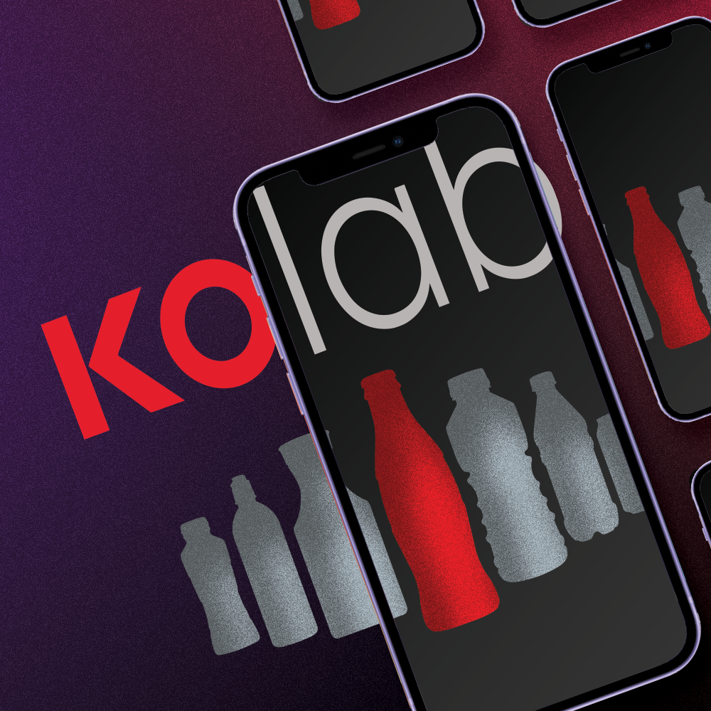
KO Lab creates experiences that help clients understand shopper behavior and apply those insights to in-store marketing. I worked with a developer to design a user-friendly website where clients could explore KO Lab’s experiences and sign up for in-person packages. I also created a downloadable infographic explaining the difference between KO Lab’s two studios.
Objective:
Create a website for KO Lab that showcased its experiences and let clients book in-person packages, supported by an infographic comparing its two studios.
Role:
Product Design
UX / UI Design
Communication Design
Status:
Launched in 2019.
To commemorate Coca-Cola’s acquisition of Costa Coffee, I designed concepts for a collectible pin that would join Costa’s long-standing pin collection. The challenge was blending two iconic brands into one small piece. I also explored materials and treatments, including cutouts, spinning parts and dimensional layers.
Objective:
Design a pin that brought together the Coca-Cola and Costa brands and fit Costa’s existing collectible series.
Role:
Product Design
Brand Design
Status:
Concepts presented to leadership.
During the COVID pandemic, shoppers couldn’t see high-value products in person before buying. As one of four designers on the UI team, I designed screens for a virtual store concept where a short Q&A curated products to each shopper’s needs. Shoppers could customize each item and connect with Samsung experts to answer questions.
Objective:
Give shoppers the confidence to buy high-value Samsung products online when in-store visits weren’t possible.
Role:
UI Design
Status:
Concept presented to Samsung.